 Sparklines are mini charts that are embedded into a worksheet, usually immediately adjacent to the data. Sparklines are only relatively new in Excel and probably haven’t gained the
acceptance or understanding that Microsoft would like. So, you’ll now find them in the Quick Analysis tools where you can easily implement them without too much head scratching.
![]()
![]()
Try This Yourself: |
|
Open File |
Before starting this exercise you MUST open the file E1355 Quick Analysis_4.xlsx… |
|
Click in cell B5, hold down |
|
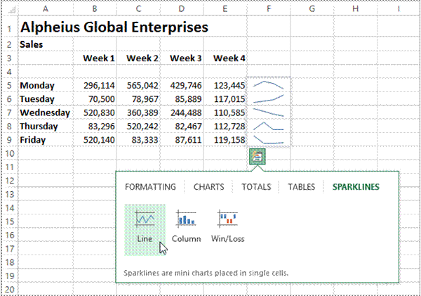
Click on the Quick Analysis button, then click on the SPARKLINES tab |
|
Point to Line to display a line drawing showing trends for each row across the four weeks |
|
Point to Column to display the trend as columns rather than a continuous line |
|
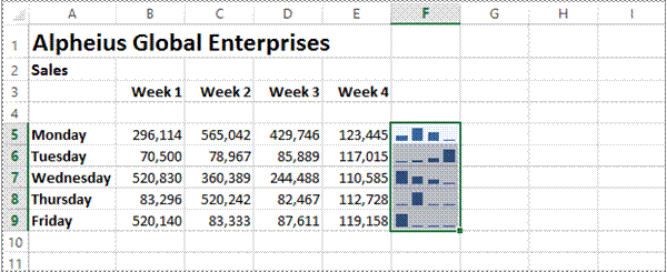
Click on Column to add |


In computer terminology a table is created when data is organised into rows and columns. You’d think then that a worksheet would be a table – but it is not in the Excel definition. In Excel a table
does have columns and rows of continuous data. But it must also have headings which provide filter buttons. Creating a table is not hard, but it is much easier using Quick Tables.
![]()
![]()

![]()
Try This Yourself: |
|
Open File |
Before starting this exercise you MUST open the file E1355 Quick Analysis_5.xlsx… |
|
Click in any cell containing data |
|
Hold down + |
|
Using the scroll bars, scroll to the bottom right corner of the selection, click on the Quick Analysis button, then click on the TABLES tab |
|
Click on Table to turn the selected range into a table |
|
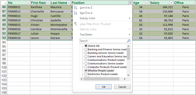
Scroll across and on the drop arrow for Position to see sorting and filtering options |
|
Click on Select All to remove the tick, then click on Effective People Leader so it appears ticked |
|
Click on [OK] to see only those people with this position title |
The Quick Analysis Tools
![]()
Tasks: |
Completed: |
|
|
Before starting this exercise you MUST have completed all of the topics in the chapter The Quick Analysis Tools… |
|
|
Open the workbook PE_Quick Analysis.xlsx (it can be found in the same folder as the student files) |
c |
|
Use the Quick Analysis tools to apply a colour scale to the data in the worksheet |
c |
|
Use the Quick Analysis tools to create a chart for the Overheads data. This chart should be a clustered column chart that has the column headings as the x axis, and displays the legend at the bottom of the chart. Make the chart title Cost of Overheads. |
c |
|
Reposition the chart below the data |
c |
|
c |
|
|
Use the Quick Analysis tools to create Sparklines for the Qtr1 to Qtr4 |
|
|
Use the Save As command to save the workbook as PE_Quick Analysis (Completed).xlsx |
c |

Traditionally, printing means producing your document on paper, but in today’s Web and online world it might mean printing to the Web or to another file. Excel gives you a lot of control
over what and how much to print, as well as enabling you to select the printer to use. You can print one or multiple copies of a document, one or multiple pages and even collate copies.

For Your Reference…
To print a document:
1. Click on the File Tab
2. Click on Print
Handy to Know…
· You can also print a document directly, without opening the Print dialog box. Click the arrow on the Quick Access toolbar, Click Quick Print. This will send one copy of the document directly to the printer.


Charts provide a way of seeing trends in the data in your worksheet. The charting feature in Excel is extremely flexible and powerful and allows you to create a wide range of charts from
any of the Insert commands in the Charts group on the
![]()
![]()
The first step when creating a chart is to select the data from the worksheet that you want to chart. It is important to remember that the selected range (which can be either contiguous or non-contiguous), should include headings (e.g. names of months, countries, departments, etc). These become labels on the chart. Secondly, the selected range should not (normally) include totals as these are inserted automatically when a chart is created.
The second step is to create a chart using the INSERT tab on the ribbon. You can choose a Recommended Chart where Excel analyses the selected data and suggests several possible chart layouts.
Alternatively you can create the chart yourself from scratch by choosing one of the Insert commands in the Charts group. Charts that you create in Excel can be either embedded into a worksheet, or they can exist on their own sheets, known as chart sheets.
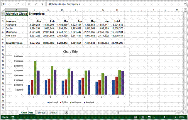
Charts that appear within a worksheet are known as embedded charts. A chart is really an object that sits on top of the worksheet – unlike numbers and letters, charts are not actually placed into worksheet cells.

If you want to keep your chart separate from the data you can move the chart to its own sheet. Chart sheets make it easier and more convenient to work with your chart because you’ll see more of it on the screen – since the data is not there!
A chart is far more effective at communicating results, outcomes or trends than a table of figures displaying the same information. Different chart types have been created to
communicate different types of information. Some charts show simple relationships between values, while others are designed for quite technical purposes. Here is a summary of the use of different chart types.
Column, Bar
|
These chart types, either in 2D or 3D, are used to compare values across categories. For example, they could compare the populations of different countries. |
Line, Area
|
Lines in 2D or 3D are useful for showing trends such as sales or employment figures. An area chart is a line chart with the area below the line filled in. |
Surface
|
The surface chart plots trends in two dimensions. You could use this to plot departmental sales figures over time. The chart then shows you the trends between departments, as well as the sales trends over time. |
Pie, Doughnut
|
If you want to show proportion, such as the sales figures from different departments that make up a total, then the pie and doughnut charts are for you. The only variation between the doughnut chart and the pie chart is that the doughnut chart can display more than one series of values. |
Stock
|
The stock chart type has been designed to show the stock figures for a day, and the trend over time. At its simplest, you can plot the high, low and close figures, and at its most complex, the volume, open, high, low, and close. It can be adapted to show the relationships between any five sets of values. |
XY (Scatter)
|
Scatter diagrams are used to display the relationship between two variables. For example, you could research the age and price of a series of cars, and plot the values you find. You could also investigate the height and weight relationship of a group of people. |
Radar
|
A radar diagram is designed to show the change in values from a central point. For example, it can be used to show mobile telephone coverage, including multiple networks and multiple measurements. |
Source: https://www.sgul.ac.uk/about/our-professional-services/information-services/library/documents/training-manuals/Excel-Fundamentals-Manual.pdf
Web site to visit: https://www.sgul.ac.uk
Author of the text: indicated on the source document of the above text
If you are the author of the text above and you not agree to share your knowledge for teaching, research, scholarship (for fair use as indicated in the United States copyrigh low) please send us an e-mail and we will remove your text quickly. Fair use is a limitation and exception to the exclusive right granted by copyright law to the author of a creative work. In United States copyright law, fair use is a doctrine that permits limited use of copyrighted material without acquiring permission from the rights holders. Examples of fair use include commentary, search engines, criticism, news reporting, research, teaching, library archiving and scholarship. It provides for the legal, unlicensed citation or incorporation of copyrighted material in another author's work under a four-factor balancing test. (source: http://en.wikipedia.org/wiki/Fair_use)
The information of medicine and health contained in the site are of a general nature and purpose which is purely informative and for this reason may not replace in any case, the council of a doctor or a qualified entity legally to the profession.
The texts are the property of their respective authors and we thank them for giving us the opportunity to share for free to students, teachers and users of the Web their texts will used only for illustrative educational and scientific purposes only.
All the information in our site are given for nonprofit educational purposes