Any engineer designing a product or system will require exact information about materials, structures, tolerances, power and the capacities of various components, and how to combine them when trying to meet a specification. However in the past designers relied on common sense when considering the needs of the people who would use and operate the products and systems they designed. Ergonomics is a relatively new science and can be described as 'The science of looking at how people relate to the products or systems that they use or come in to contact with.'
As well as trying to improve the design of new products and systems, ergonomics is also used to improve the efficiency of existing ones. It is very important to ensure that people who spend a long time in the same position do not develop painful and crippling problems such as repetitive strain injury (RSI). Computer operators, for example sit for very long periods repeating very simple movements. One way of solving the problem may be to design a better chair. Most chairs are like the ones you sit on at school, they cannot be adjusted. We have to adjust ourselves to suit the chair which results in fidgeting, discomfort and loss of attention. Ergonomic designers believe that adjustable chairs would be better. If the operators were more comfortable, efficiency would be improved and there would be less chance of injury.
Ergonomics can be split up in to three main areas:
The study of human measurements such as height, arm length, reach, etc.
The study of bodily strength, fatigue, reaction times etc
The study of behaviour - especially the way we react to heat, light, texture, colour, noise, etc.
We shall now look at each of these areas in more detail.
The challenge for designers and engineers is to design things which can be used by the majority of the population. Because we are all different this often means providing a limited form of adjustment. The driver’s seat in a car has a number of adjustments which allow it to be customised by each driver. It is only Formula One drivers who have cockpits tailor-made to their own measurements!
Knowing the measurements of the person or persons for whom you are designing is the key to successful design. Anthropometrics is the study of facts and figures relating to the human body such as height, arm length, weight, etc. Henry Dreyfus, an American industrial designer, pioneered the gathering of this information; he called it human engineering. He was concerned about extreme dimensions as well as the average ones, as people come in all shapes and sizes. In addition to producing charts of the average anatomical sizes of all parts of the human body, he also gathered information on every conceivable aspect, such as: the amount of pressure the average foot can comfortably exert on a pedal; how hard a hand can effectively squeeze; the reach of an arm. All this information produces a very detailed picture of the average man and woman.
However, anthropometric data differs between races, and changes with time. For example, some Asian races were traditionally smaller than western races. British manufacturers exporting beds to Japan had to make smaller beds than those sold in Europe. However with improved diet and an increased protein intake, these races are quickly catching up. Most races are gradually getting bigger because of both better diet and better health care. Look at the doorways in old houses - nowadays many people have to bend down to get through them.
 If a graph is plotted of the height of any population, it will look like the one shown below. This is known as the normal distribution curve. The line through the middle of the graph is known as the 50th percentile or mean (average) value. If height were being measured, the 50th percentile would be the height that occurred most often. People whose height falls on the 50th percentile line are often said to have average height. People whose height falls on the 5th percentile can be said to be small people, while people whose height falls on the 95th percentile can be said to be tall people.
Designers should ensure that their products will be able to be used by 5th to 95th percentile users. To design for people who do not fall in to the 5th to 95th range would be very impractical. The 1st to 5th are people who are very very small whilst the 95th to 100th are very very tall.
When selecting optimum sizes it is a common mistake to always design for the average person. For example, if a door were made on the basis of average height then all those people over 50% would bump their heads on the top. Therefore we select data based on the height of the 95th percentile male. Do you know why we choose male?
Use the following criteria to decide which percentile range to select data from.
Once the correct percentile range has been chosen the actual measurements can be found in a number of ways. The simplest method is to look up anthropometric tables. These contain vast amounts of information on human dimensions in the 5th, 50th and 95th percentiles for men and women. They also contain anthropometric data on various age groups of children.
Another method is to take measurements from a sample population of users and use these people when testing prototypes.
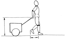
Before selecting anthropometric data you must consider how the product will be used so that you can determine where sizes will be affected by the human body. e.g. if you were carrying something such as a briefcase then the distance from your hand to the floor would be important. However if you were pulling something behind you then your stride would have to be taken in to account so that the device does not catch your heels.

A sketch such as the one shown below would be a helpful starting point. This
shows an ergonome and indicates crucial measurements.
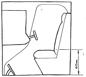
Before looking at the anthropometric tables, study your sketches and ask yourself the following questions:
Physiology is the science of how living things work. This subject is of interest to designers so that they can design products or systems within the limitations of the human body.
A car braking system must be designed in such a way that any driver can easily exert a force on the pedal and bring the car to rest. Thus information needs to be gathered on the strength of peoples’ legs and then lever and hydraulic systems designed to suit such forces. The designer must also consider which part of the body is most suited to performing a specific task. Legs are stronger than arms and are more suited to simple repetitive tasks involving large forces such as applying the brakes. Hands and fingers are more nimble and are better suited to finer controls such as a steering wheel or adjusting the volume on a radio.

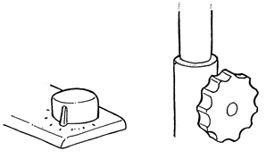
The shape and size of hand - grips vary tremendously and depend on the tasks that they are used for. The picture below shows two grips, one is for a gas cooker ring whilst the other is for adjusting the height of an office chair. The cooker control has a smooth texture and no grip as it is easy to turn and is used for fine adjustment However the chair adjuster has to be gripped firmly to enable the user to tighten it, therefore it has been serrated to provide plenty of grip.
The most effective way of developing designs for handgrips and controls is to make simple models. Materials such as plasticine or clay are ideal as they can be tested on potential users and then instantly modified if they are not right.
Psychology is the study of the mind and the way it works. Using your five senses you transmit information from the world around you to your brain. The brain interprets this information and provokes a reaction. For example, a sudden loud noise will prompt you to cover your ears with your hands.
All aspects of the environment affect the way you behave i.e. if it is sunny you may feel happy and if it is cloudy you may feel sad. In the same way a bright room will heighten your senses whereas a dull room will make you subdued. There are a variety of aspects of product design which will affect your behaviour and having an understanding of how the mind works is important when designing the human/product interface.
 Designers can improve the human/product interface by making a product easy to use. The user must be able to easily sense important information be it through touch, sight or sound and then react accordingly. For example the on/off button must be easy to find and symbols for each of the different functions of a product should be easy to understand.
The shape of a product can also suggest its function and dictate the way in which used - this is called product semantics. The picture below shows an inkjet printer. The position of the input and output trays, combined with the rounded form, suggest the path of the paper through the printer.
The display of information especially in a plane cockpit or power station control room presents a challenge for a designer. Displays showing rates of change such a speedometers can be either digital or analogue. A digital display is better for accurate measurements when the rate of change is slow whereas an analogue display is better for showing faster rates of change and giving an overall picture of what is happening. In practice a combination of both is used.
Look at a typical car dashboard. Identify which displays are analogue and which are digital and try to explain why they were chosen.
On complex control panels important information such as warnings have to be relayed quickly to the operator and this is when more than one sense may have to be called on. For instance a flashing light may not be enough to attract the pilot’s attention in the cockpit so a warning sound may also be necessary.
One recent development in microprocessor technology is the membrane switch panel. These are often found on products used out of doors such as mobile phones and cash dispensers. One problem with such panels is that the switches don't move so you are often unsure if you have pressed the button or not. The solution is to use a bleep which sounds as you press the button thus confirming that it has been pressed. If one sensation is reinforced by another then you feel as if you have more control over the product or system.
As mentioned in the aesthetics booklet, colour can affect our behaviour and feelings towards a product. A red room will make people feel aggressive whereas a green room will make them feel passive. The colour of products can affect our reactions to them. For example in one industrial situation factory workers complained that the boxes they had to carry were too heavy. When the colour of the boxes was changed from blue to yellow the complaints stopped.
Therefore when selecting colours for products or systems we must consider how people will react to the colours used. For example, if you want to attract attention to part of a product such as a switch, use a contrasting colour scheme.
When considering the ergonomic factors which will affect the design of a product it is helpful to carry out a task analysis exercise. This is similar to a user trip in that you imagine that you are a typical user of the product thus allowing you to identify all of the important ergonomic factors.
During this process a number of key questions need to be answered.
This information can be displayed by producing an annotated sketch which highlights all of the key areas to consider.
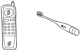
 A phone and an electric toothbrush are shown below.
For each product complete the following tasks.

Source: http://www.earlstonhigh.scotborders.sch.uk/learningzone/technical/Information%20Files/Craft%20and%20Design%20Ergonomics.doc
Web site to visit: http://www.earlstonhigh.scotborders.sch.uk
Author of the text: indicated on the source document of the above text
If you are the author of the text above and you not agree to share your knowledge for teaching, research, scholarship (for fair use as indicated in the United States copyrigh low) please send us an e-mail and we will remove your text quickly. Fair use is a limitation and exception to the exclusive right granted by copyright law to the author of a creative work. In United States copyright law, fair use is a doctrine that permits limited use of copyrighted material without acquiring permission from the rights holders. Examples of fair use include commentary, search engines, criticism, news reporting, research, teaching, library archiving and scholarship. It provides for the legal, unlicensed citation or incorporation of copyrighted material in another author's work under a four-factor balancing test. (source: http://en.wikipedia.org/wiki/Fair_use)
The information of medicine and health contained in the site are of a general nature and purpose which is purely informative and for this reason may not replace in any case, the council of a doctor or a qualified entity legally to the profession.
The texts are the property of their respective authors and we thank them for giving us the opportunity to share for free to students, teachers and users of the Web their texts will used only for illustrative educational and scientific purposes only.
All the information in our site are given for nonprofit educational purposes